We are always telling our clients that the first step in a successful marketing campaign, both online and in print, starts with a professionally designed logo. Your logo is something that people will identify from a distance, in print, and on promotional items. What we found interesting recently was what Google did with their logo.
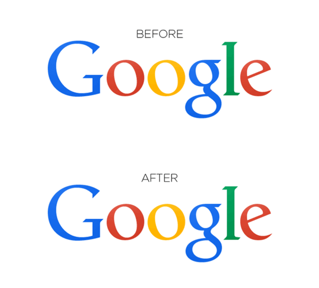
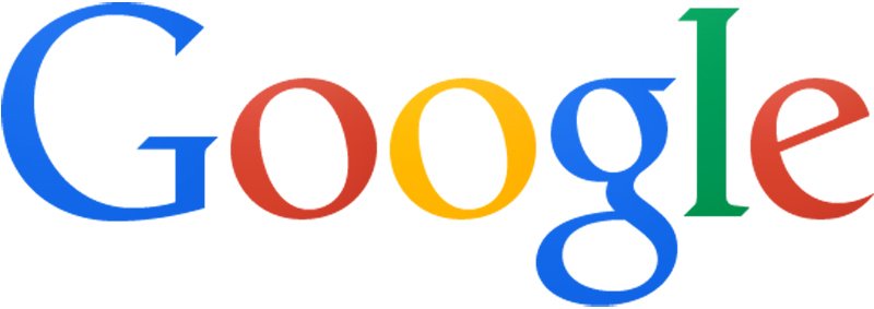
Hereʻs how their logo was before:
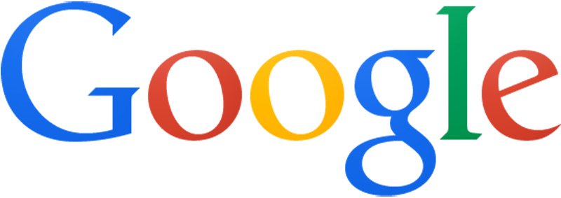
And this is how they changed it:
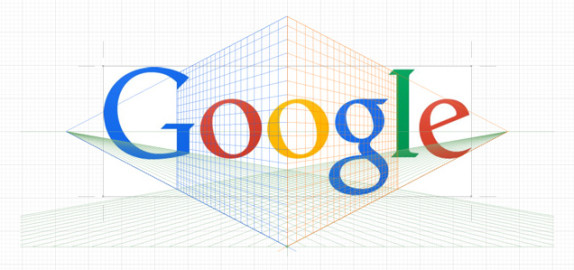
Do you see it? Well, youʻre not the only one. We barely noticed the subtle difference in the two but after seeing this image, we were fully clued in:
 (Photo by GizModo)
Why would someone change something so minute? Because it looked better to someone in their marketing departmentʻs eyes. Itʻs called kerning, and if you Google it and click images, youʻll find out just how annoying it can be! Even making small changes like this, like for instance how we changed the Hawaii Nui Logo, in order to rebrand or even start a company, reinforces the concept of having a professional brand identity!


